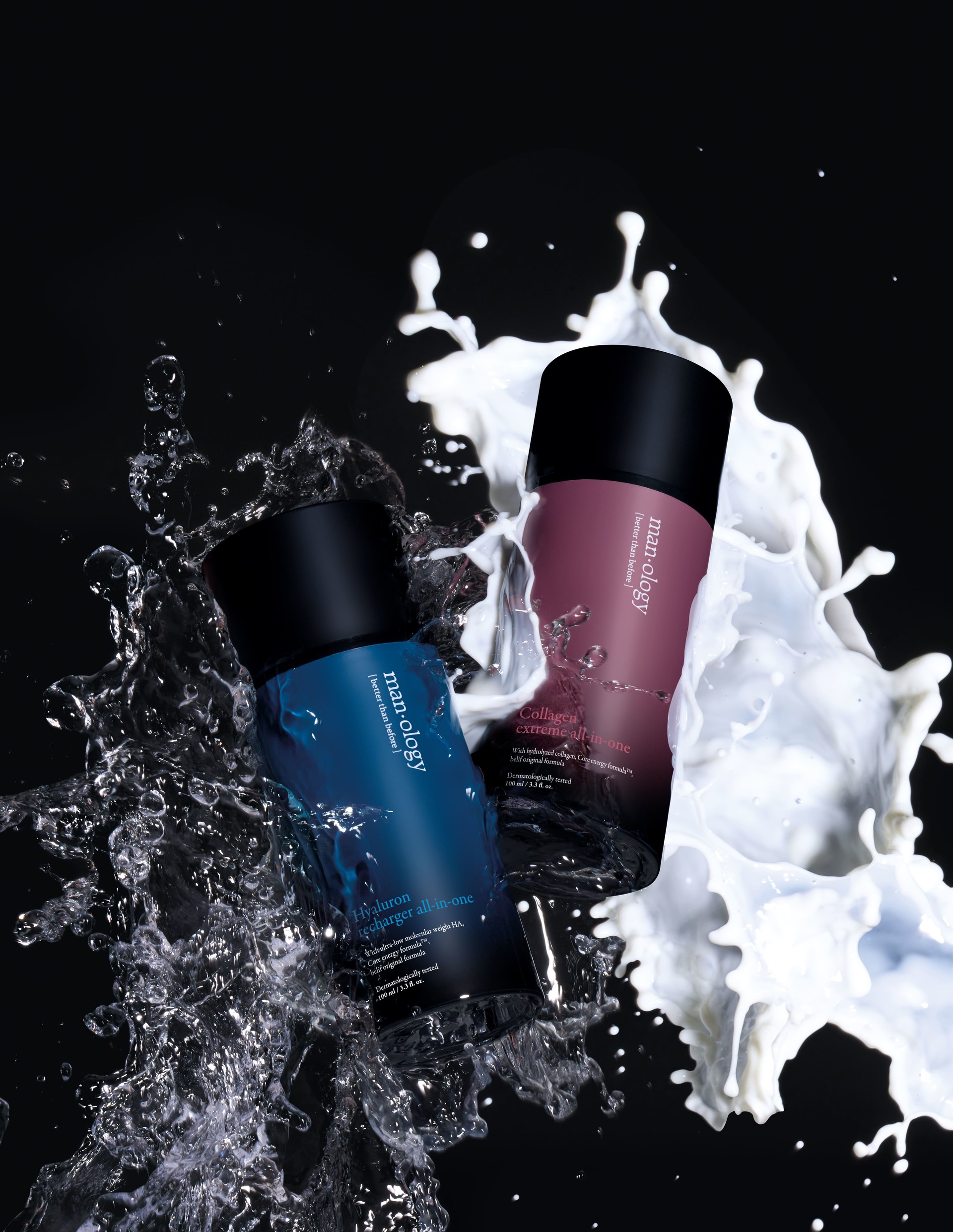
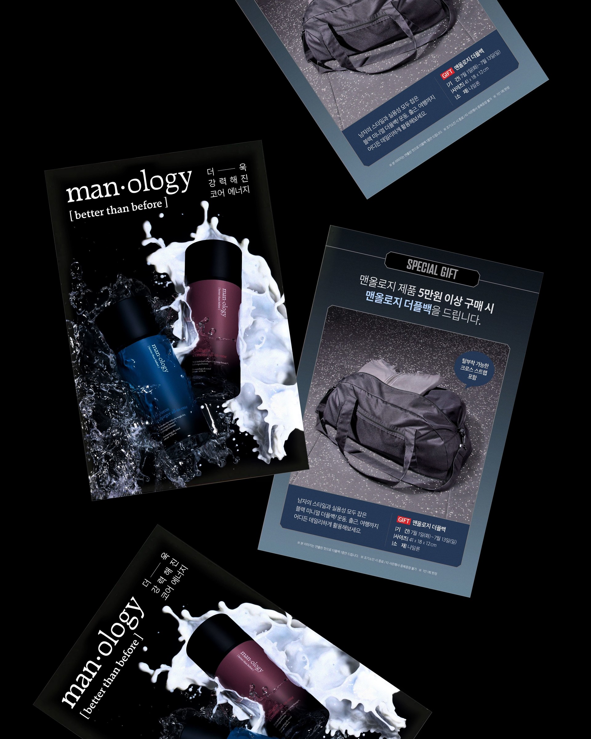
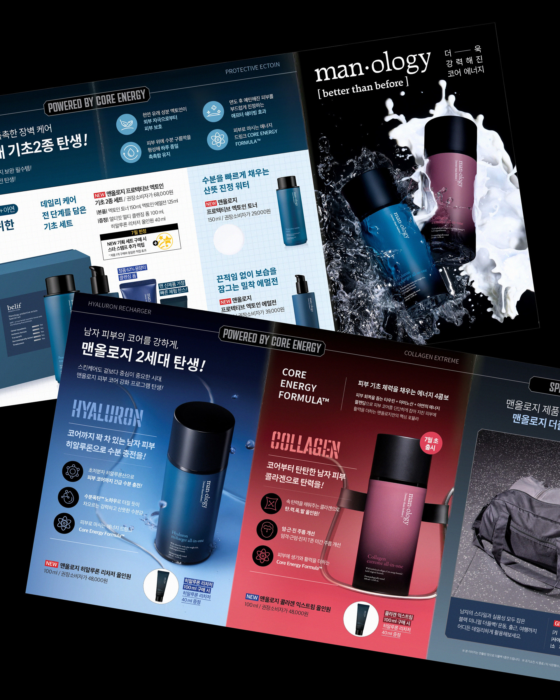
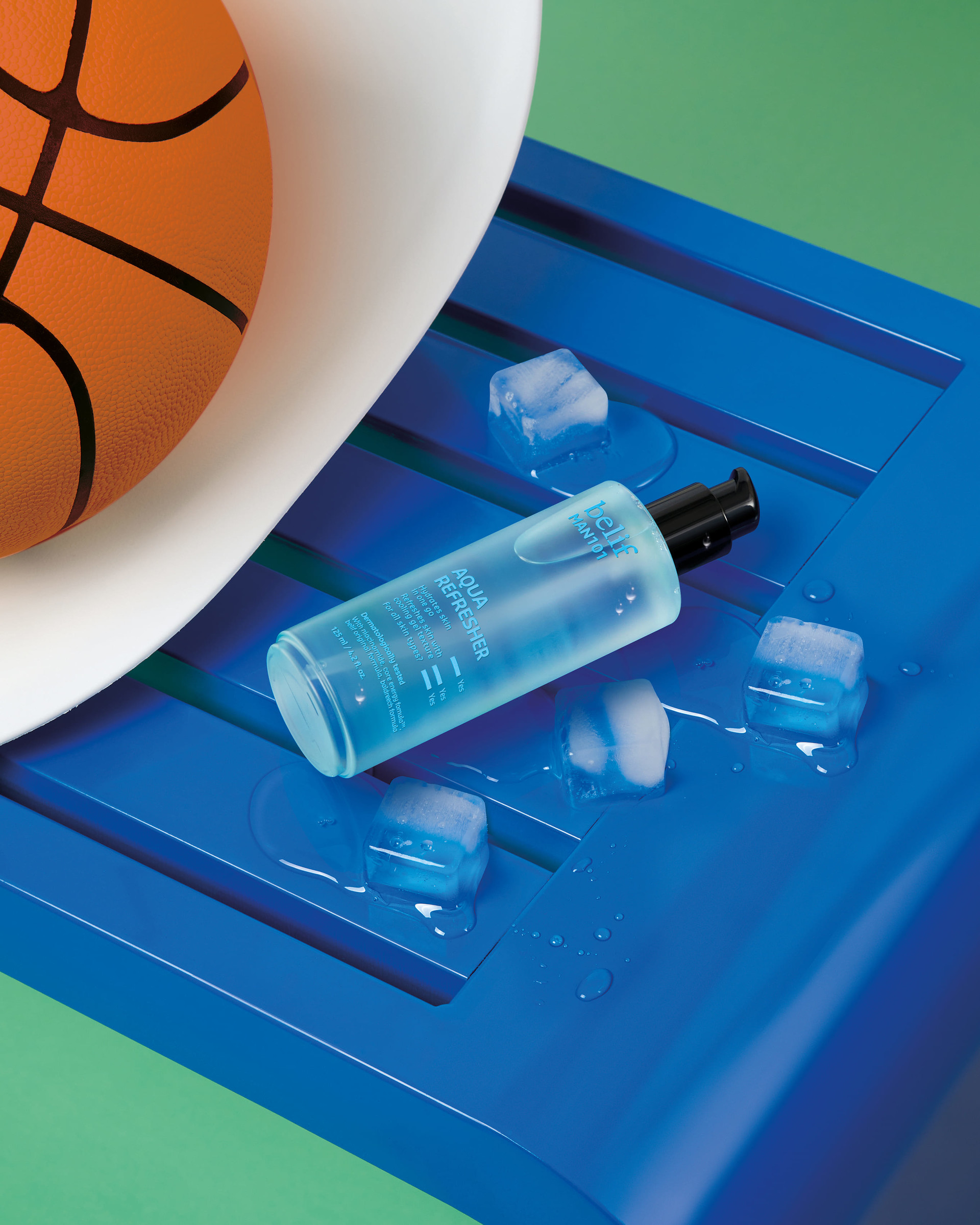
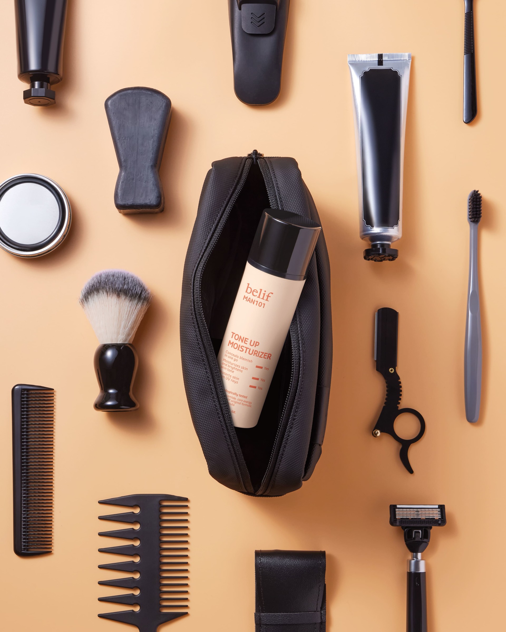
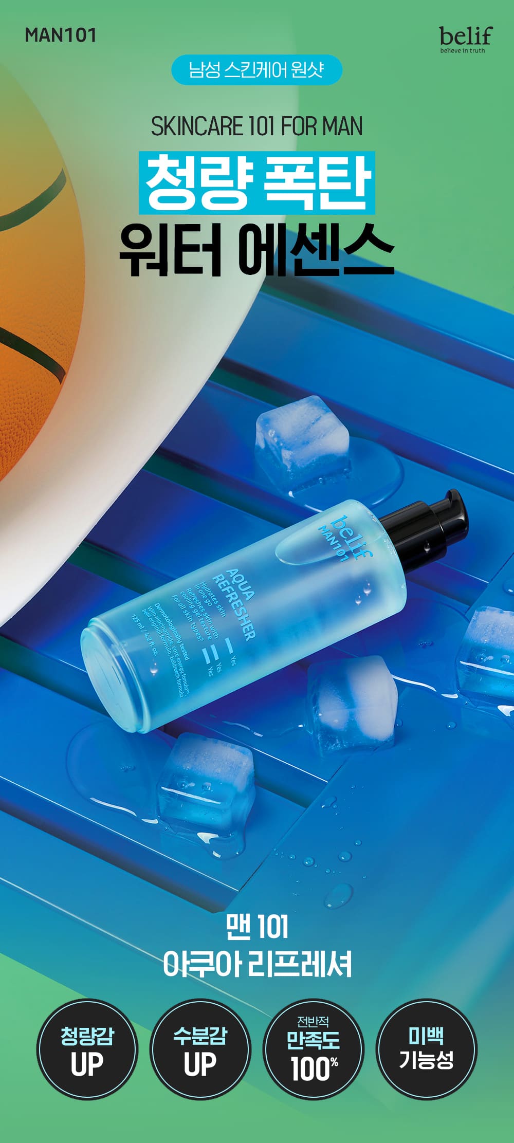
We produced the key visual, graphics, and leaflet (Monthly DM) for the men's cosmetic brand Manology's upgraded all-in-one line and its newly launched Man101 line. Building on the brand's expanded heritage and product philosophy, we clarified the visual direction of two lines catering to distinct lifestyles and skincare needs.
Manology, the premium line, was branded with a mood of stability and trust for customers seeking deeper skin solutions and intensive care, using a refined color palette and dense graphic texture to emphasize solidity and focused care. Man101, in contrast, was built around a sensory, energetic visual tone for customers who prefer a light, lively daily routine, applying flexible color matching and dynamic graphic elements to deliver a trendy, approachable brand experience. The project reinforced each line's distinct identity while naturally conveying the skincare philosophy behind each product's intended lifestyle.